简体中文
繁體中文
English
Pусский
日本語
ภาษาไทย
Tiếng Việt
Bahasa Indonesia
Español
हिन्दी
Filippiiniläinen
Français
Deutsch
Português
Türkçe
한국어
العربية
How To Draw Supply & Demand Zones – The Right Way!
Abstract:In over a decade of teaching Supply & Demand trading, I still see Supply and Demand zones drawn the wrong way. In this article, we’re going to address some common mistakes and clear up the confusion of how to draw Supply & Demand zones once and for all!

There are two major components of a Supply or Demand zone – the Impulse Move and the Base.
Contrary to popular opinion, the Impulse Move is what defines the zone. Without an Impulse, there is no zone – just an area of consolidation!
What do I mean by that? Well, lets take a look…
In the diagram below, we can see two representations of a move out of a base.
The (imaginary) market makes a fast, impulsive move out of the first base. The market doesnt look back – it shoots straight up, caused by an imbalance of buyers vs. sellers. This impulsive move confirms that the base IS indeed a Demand Zone.
The second illustration represents a market that moves slowly out of a base, making numerous “back and forth” retests. This is not a Demand Zone and will very likely fail if the market comes back to the base again.
In summary, its always the Impulse that defines the zone, and defining the base has secondary importance.
Once you understand this concept, youll find yourself looking for impulses on a chart first.

Now lets look at a real example of some impulse moves on a 1 hour EURUSD chart.
I havent drawn the zones yet, because I want you to notice the fast impulse moves identified on the chart below. Notice how quickly the market moved up or down at the areas marked by arrows. The moves occurred in a short period of time, using a small number of candlebars and minimal (or zero) retraces:

Once we have identified a fast impulse move, it becomes a lot easier to find the base of the zone.
Heres the Supply and Demand zones associated with those impulse moves. You can see the edge of the zone starts exactly where the market shot up or down.

Were going to zoom in to one of those zones and see how the upper and lower bounds of the zone are drawn.
In the Supply Zone on the EURUSD chart below, the lower bound is the exact point the market dropped very quickly out of that small range.
The upper bound always uses the highest candle wick of the range.
Finally, when the market retraces to the zone, we can enter a short trade with a stoploss above the zone.

In the chart below, I‘ve marked a Demand Zone. This time, there are a few more candles to mark a distinct base. However, the method for drawing the zone doesn’t change.
The fast impulse move away, marks the top bound of the Demand Zone and the lowest candle wick marks the lower bound.
When the market returns to the zone, we can buy (go long) the market with a stoploss below the zone.

The small range that precedes the impulse move is known as the base. Ideally, it should be at least two candles, but not so many candles that it looks like a large consolidation range.
The Solana (SOLUSD) Cryptocurrency chart below shows a good Supply Zone base. There are 5 candles before the fast impulse drop.
Notice how the candle bodies line up almost exactly with that impulse move out of the base?
You wont always find the candle bodies lining up this uniformly, but when they do, it makes for a good zone with extra confluence.

Now lets look at some common mistakes I see from students of Supply & Demand.
Remember, a zone must be identified by a FAST move away. Below is an example of a consolidation area (on a 5 minute EURGBP chart) that isnt a Supply Zone.
There was no fast move away from the area. In fact, the area was retested with an immediate “wick back” as soon as it started moving down. This slow stair-stepping action is exactly what you dont want to see for a good zone!

Finally, I see these mistakes a lot.
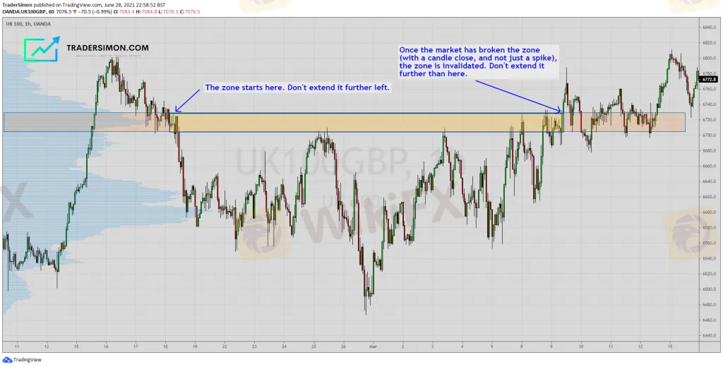
A zone should start at a small range of candles and end when the zone has been broken.
In this FTSE 100 hourly chart below, the Supply Zone has been drawn incorrectly and extends much too far to the left, past the original base of the zone.
Notice the multiple tests of Supply until the market finally broke through Supply and closed above. It is at that point, that the zone should end.

By now, you should now have a good understanding of how to draw Supply and Demand zones correctly.
If you enjoyed this article, please share it and pass it on via social media!


Disclaimer:
The views in this article only represent the author's personal views, and do not constitute investment advice on this platform. This platform does not guarantee the accuracy, completeness and timeliness of the information in the article, and will not be liable for any loss caused by the use of or reliance on the information in the article.
Read more

Weekly Fundamental Gold Price Forecast: Hawkish Central Banks a Hurdle
WEEKLY FUNDAMENTAL GOLD PRICE FORECAST: NEUTRAL

Gold Prices at Risk, Eyeing the Fed’s Key Inflation Gauge. Will XAU/USD Clear Support?
GOLD, XAU/USD, TREASURY YIELDS, CORE PCE, TECHNICAL ANALYSIS - TALKING POINTS:

British Pound (GBP) Price Outlook: EUR/GBP Downside Risk as ECB Meets
EUR/GBP PRICE, NEWS AND ANALYSIS:

Dollar Up, Yen Down as Investors Focus on Central Bank Policy Decisions
The dollar was up on Thursday morning in Asia, with the yen and euro on a downward trend ahead of central bank policy decisions in Japan and Europe.
WikiFX Broker
Latest News
The Withdrawal Trap: How Scam Brokers Lure Victims into Paying More
FCA to Investors: Think Twice Before Trusting These Brokers
Trump\s tariffs: How could they affect the UK and your money
Trump gambles it all on global tariffs he\s wanted for decades
TradingView Brings Live Market Charts to Telegram Users with New Mini App
Trump tariffs: How will India navigate a world on the brink of a trade war?
Interactive Brokers Launches Forecast Contracts in Canada for Market Predictions
Authorities Alert: MAS Impersonation Scam Hits Singapore
Stocks fall again as Trump tariff jitters continue
IG Group Acquires Freetrade for £160M to Expand UK Investment Market
Currency Calculator


